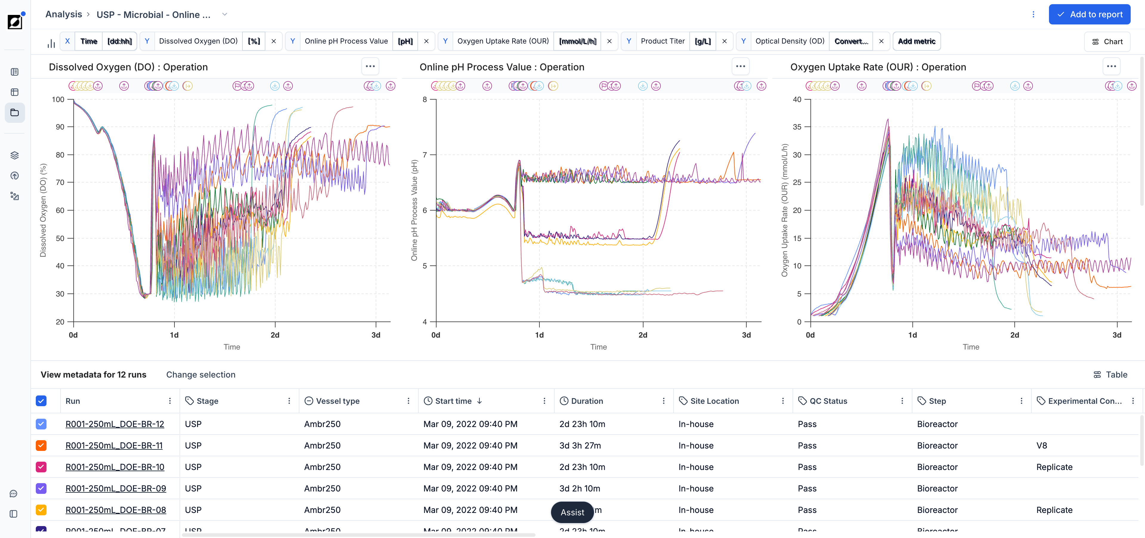
The Analysis page is your go-to destination for visualizing and analyzing your bioprocess data. Choose between line charts, scatter charts, and bar charts to tell the story behind your data. Use line charts for timeseries data, scatter charts for quantitative cross-run comparisons, and bar charts for a clean categorical summary view.
Navigating to the Analysis Page
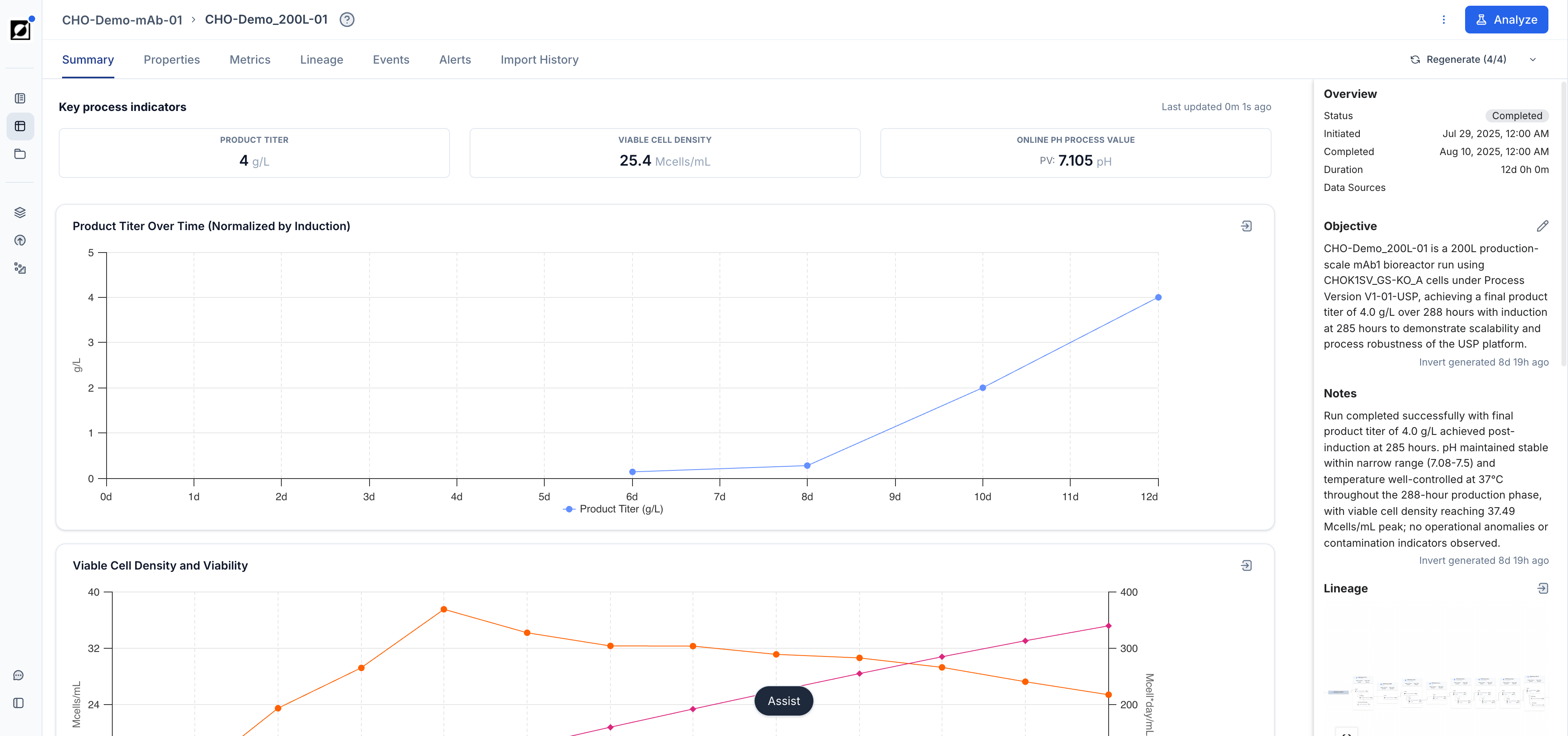
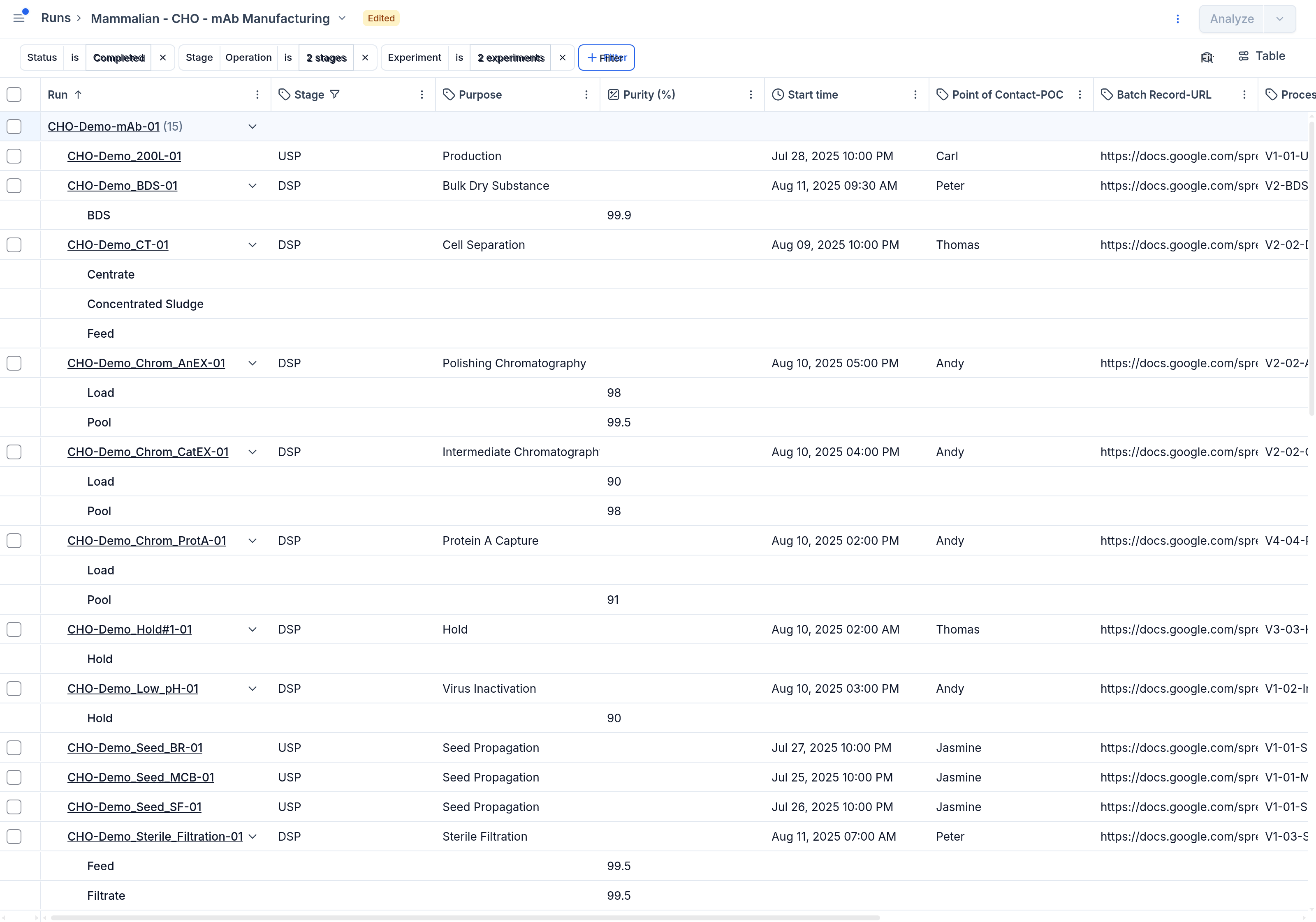
To access the Analysis page, start by navigating to the Runs page and selecting a set of runs you wish to analyze. Press the 'Analyze' button in the top right corner of this view to transition to the Analysis page. The line chart is the default. Switch chart types using the Chart settings button in the chart header.
Workflow
-
Metric selection
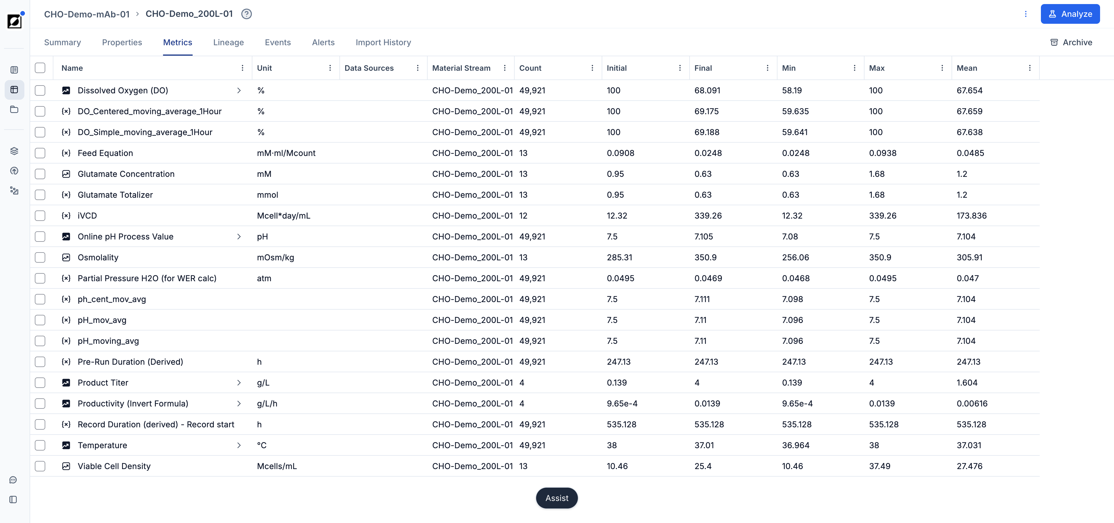
Select one or multiple metrics from the metric dropdown. Formulas can be added here as well — type the formula name and click 'Add'.
-
Chart settings
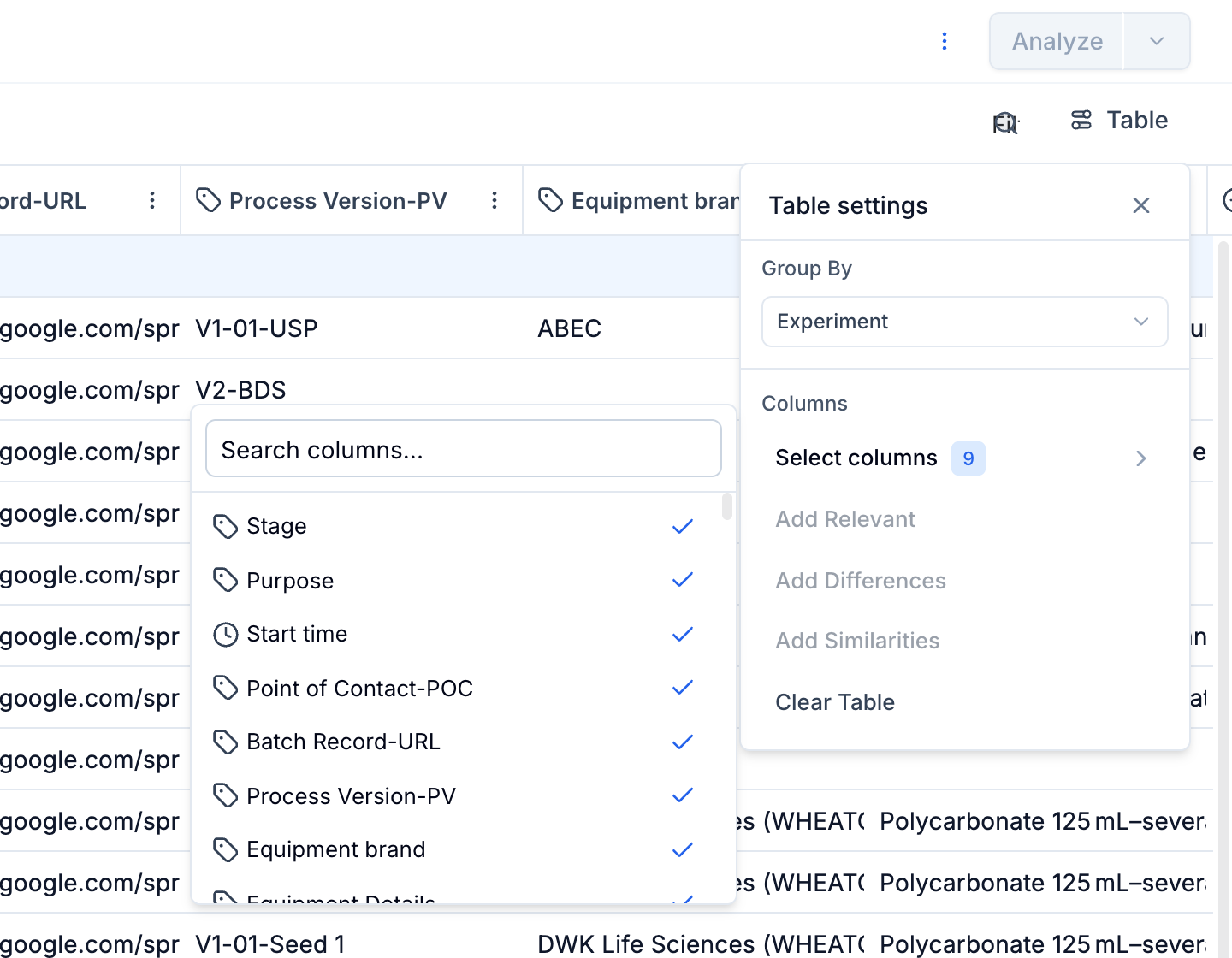
Click the Chart button in the chart header to open the chart settings panel. From here you can change chart type, split by, layout, axis ranges, events, grouping, coloring, and time filters.
-
Run selection
Update run selection as needed by checking/unchecking run checkboxes in the table underneath the graph. Optionally, click 'Run selection' for altering the full list of runs included in the analysis.
-
Full Screen view
Switch to Full Screen view for a close-up view of the graph.
-
Export
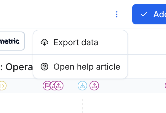
Export the graph as an image (.PNG) or export the displayed data as an Excel file.
-
Save Analysis
Save the analysis as a report by creating a new report or appending it to an existing report.
Chart Settings
All chart configuration is in the Chart button popover, accessible from the chart header. It contains the following sections:
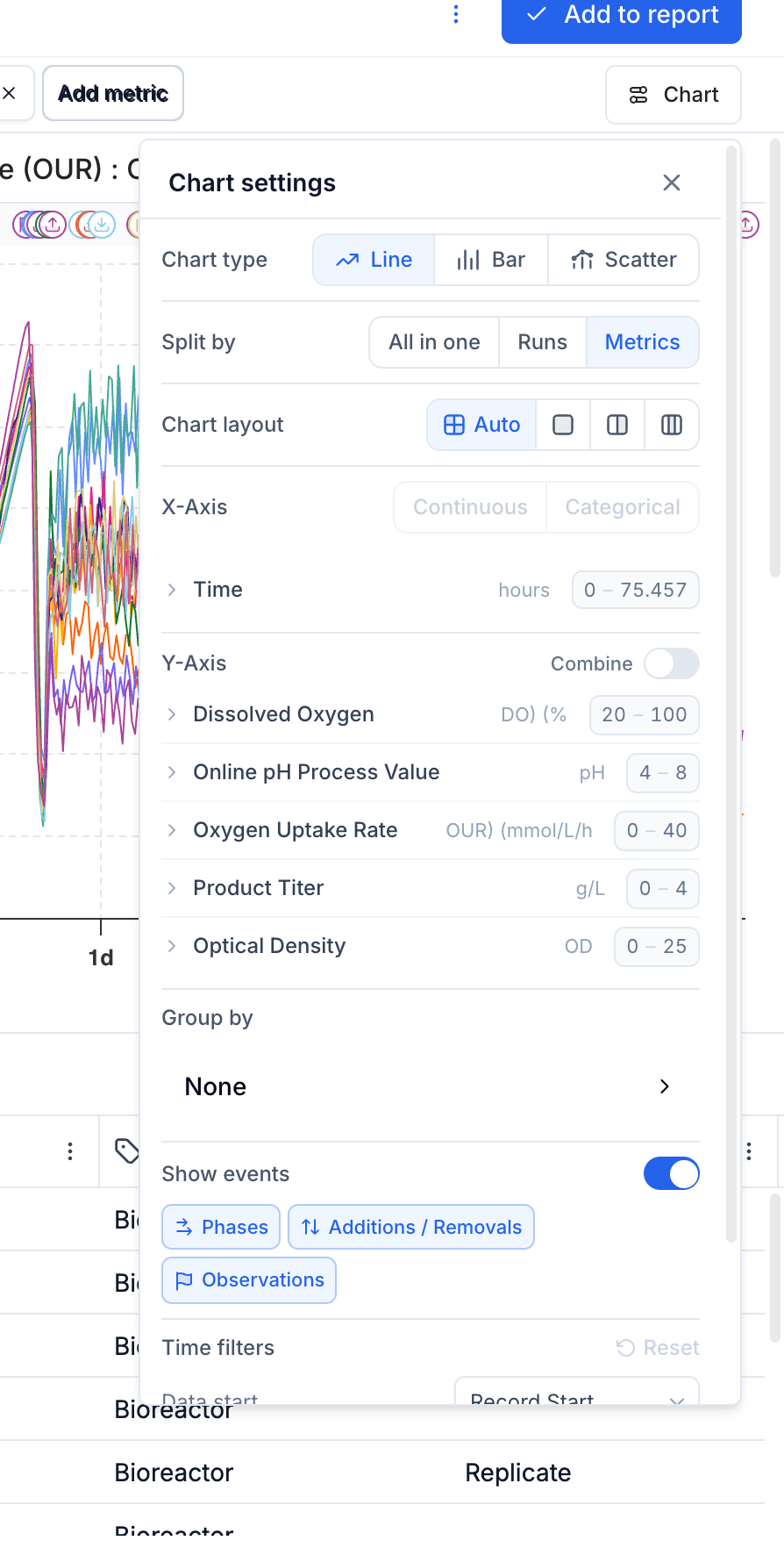
Chart Type
Switch between Line, Bar, and Scatter using the button group at the top of the panel.
Split By
Controls how runs and metrics are distributed across graphs:
- Separate — one graph per run and metric combination.
- Split runs — one graph per run (line charts only).
- Split metrics — one graph per metric; compare a single metric across multiple runs.
- All in one — all runs and metrics in a single graph.
Chart Layout
Controls how many charts appear side-by-side: Auto, Full width, 2 columns, or 3 columns.
X-Axis Range
Set a custom Min, Max, and optional Interval for the x-axis. For time-based line charts, values are entered in the selected time unit (e.g. hours). Overrides compose with drag-zoom so both can be used together. Overridden values are highlighted in the panel. This control is disabled for bar charts and categorical scatter charts.
Y-Axis Settings
Set a custom Min, Max, and optional Interval for each y-axis. Toggle Combined Y-Axis to merge all metrics onto a single axis. When Split by Metrics is active, each metric gets its own independent axis. Values support Python-style exponentiation (e.g. 10**6).
Events (Line Charts)
Toggle Show events on or off. When on, filter by event category — Phases, Additions / Removals, and Observations — using the category buttons.
Time Filters (Line Charts)
Use Data Start and Data End to restrict the x-axis to a specific window (e.g. growth phase only, pre-run data). Use Normalization Basis to control what t=0 means — Run Start, a specific event type (e.g. Feed Start), or a phase start. Click Reset to restore defaults.
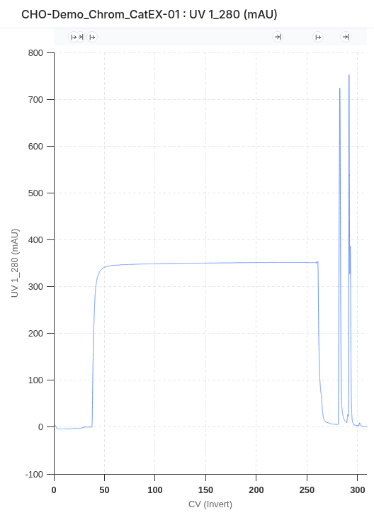
Line Charts

Visualization of Timeseries Data
The line chart is the primary tool for visualizing timeseries data. It supports a wide range of layouts for close-up single-run views, per-metric comparisons, and all-in-one overviews across a full experiment.
Drag Zoom (X-Axis)
Click and drag within the graph to zoom into a specific time window. The current zoom bounds appear in the top right corner under "ERT" (Elapsed Run Time). Click the ✕ on the zoom annotation to reset. Drag zoom composes with the X-axis range set in the Chart settings panel — both can be active at the same time.
Custom Axis Ranges
Both the X and Y axes support manually entered Min / Max / Interval values, set via the Chart settings panel (see Chart Settings above). Overridden values are shown highlighted; use the Reset button within each axis section to revert individual axes to their default. Toggling Combined Y-Axis changes which axes are displayed, but stored zoom values for each axis are preserved.
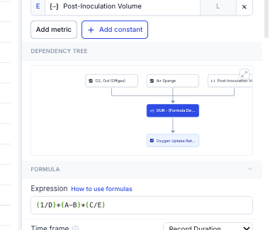
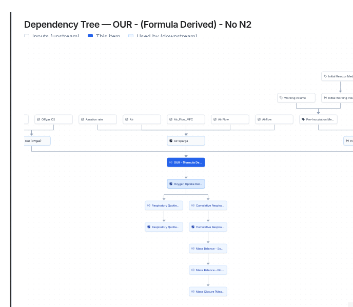
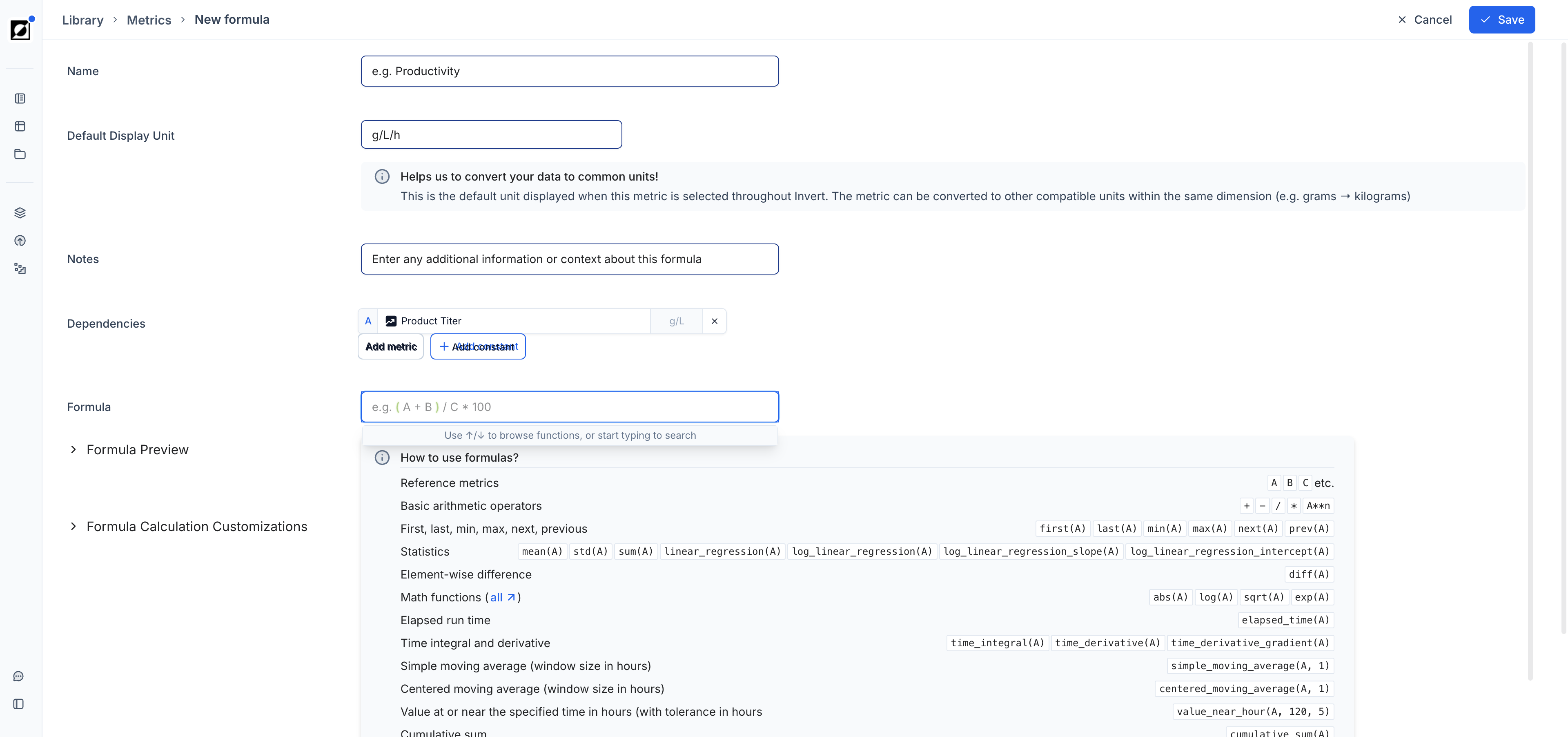
Formulas
Create derived metrics using the built-in formula editor. Type a new metric name into the metric dropdown field and click 'Add'. Enter the formula name, input dependencies, and expression in the editor. Use the formula preview to verify results before saving. For full details on supported operations and formula types, see the Library article. As an example, air flow rate (L/h) and reactor volume (L) can be combined to calculate VVM — a scale-independent aeration metric that enables meaningful comparison across bioreactor sizes ranging from 0.25 L to 100,000 L.
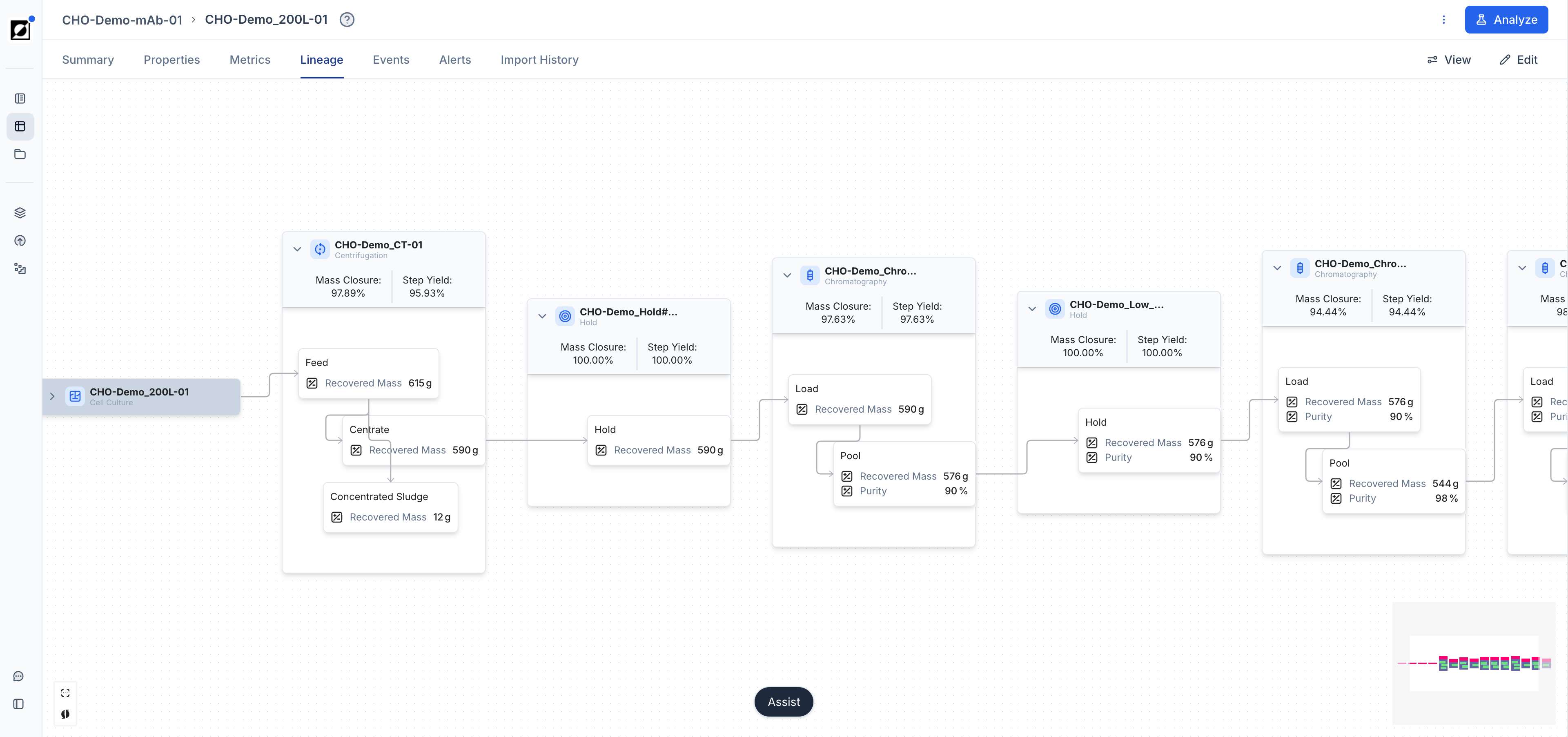
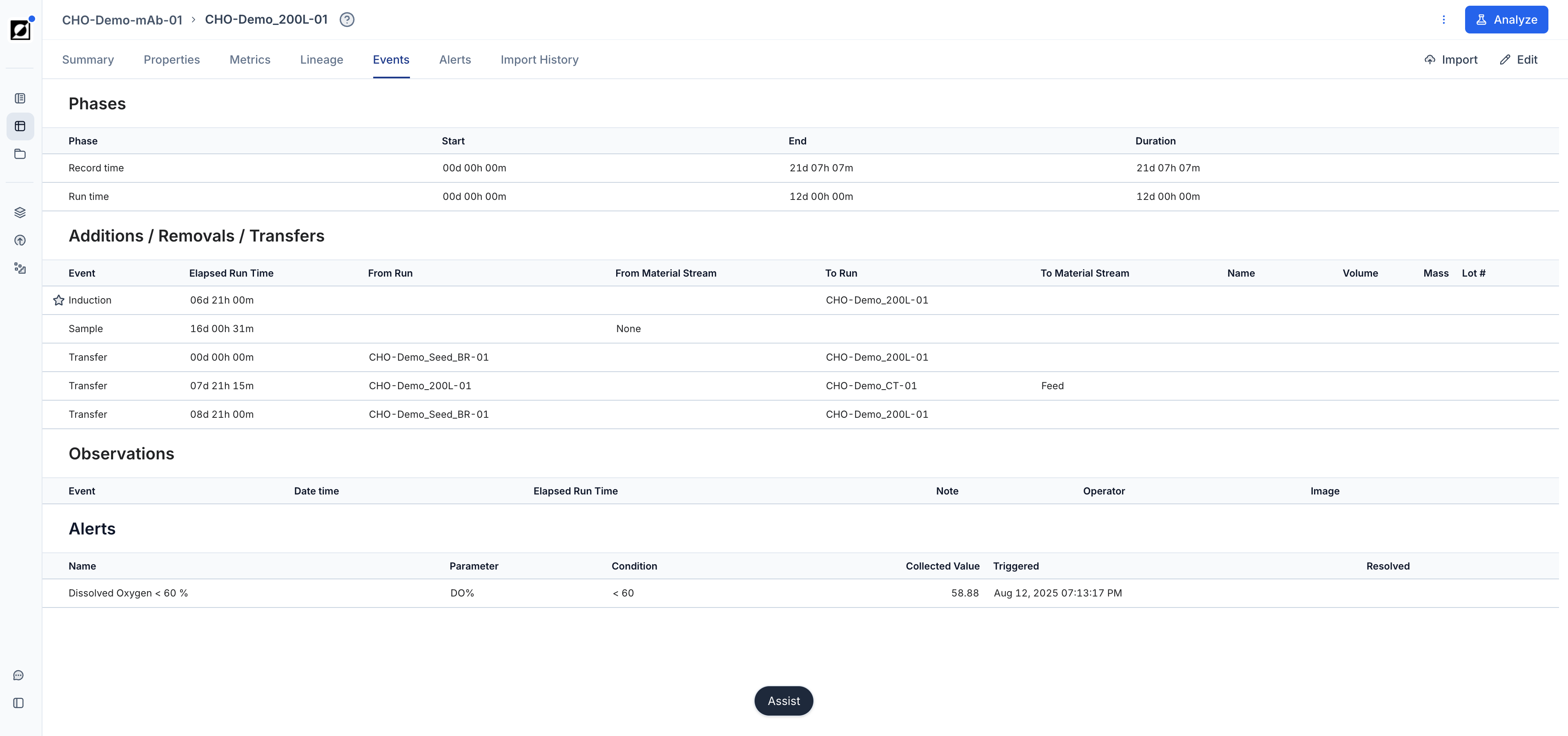
Events & Phases
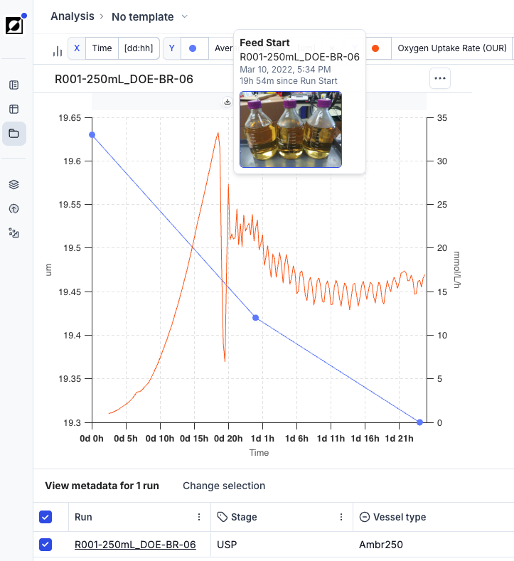
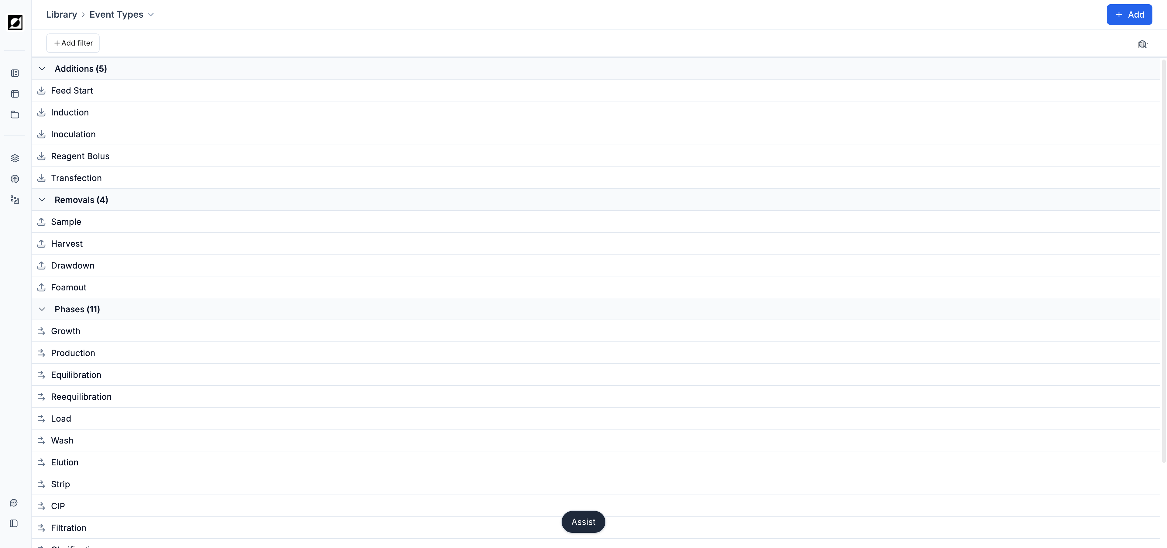
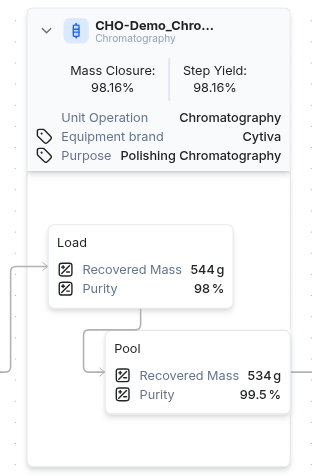
Utilize the event annotation feature to create time-stamped and interactive event notes, enhancing your analysis. Supported event types are: Inoculation, Induction, Transfection, Sample, Harvest, Drawdown, Feed Start, Foamout, and Observation. Optionally, upload an image to provide additional context to your data. Control which event categories appear on the graph using the Show events toggle and category filters in the Chart settings panel.
Phase markers are visual indicators that delineate different process segments, such as Growth or Production phase. In a formula context, a phase can be selected in the Applied Time Frame dropdown, scoping the formula calculation to that segment only — for example, a Specific Growth Rate formula applied to the Growth phase, or a Productivity formula applied to the Production phase.
Grouping & Coloring
The chart settings panel offers Group by and Color by as two tabs of the same control, available for line, bar, and scatter charts.
Use Group by to aggregate and compare related runs based on specific attributes, such as "Experimental Condition", "Strain", or "Alias". When runs are grouped, it enables the analysis of variability (shaded regions representing 16th and 84th percentiles) and central tendencies (median) within those groups. Run IDs in run tables and chart legends are replaced by the attribute name enabling users to assign custom run names.
Use Color by to color chart series by a run attribute or a parent metric, making it easy to distinguish groups at a glance without aggregating the data. On bar and scatter charts your Group by selection carries over to Color by automatically when you switch chart type.
Metric/Formula Notes
Add notes to metrics or formulas from the Library editing page. On the Analysis page, hover over a metric or formula name to surface the note as a tooltip — useful for documenting assumptions, data sources, or calculation details directly within the chart view.
Run Data Table Customization
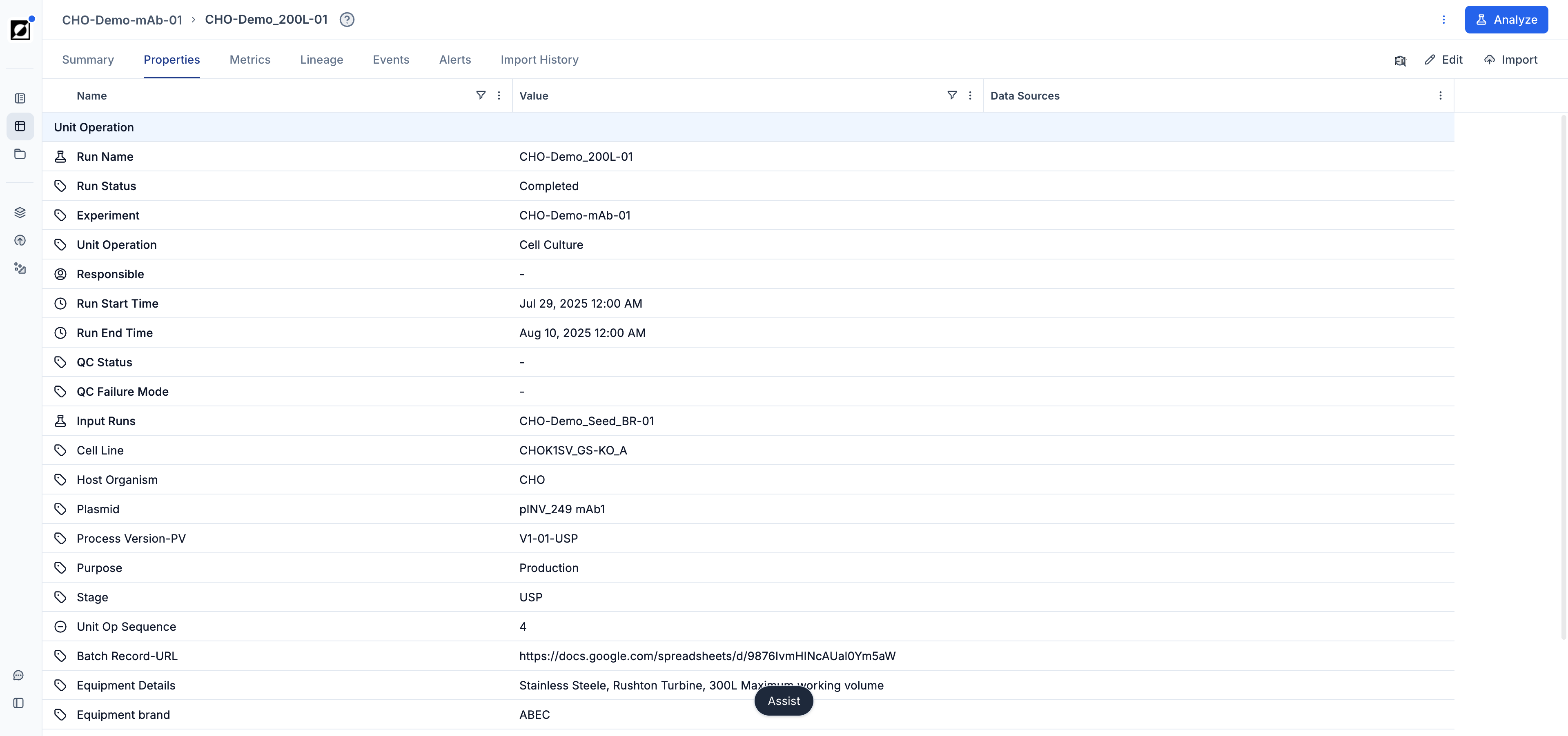
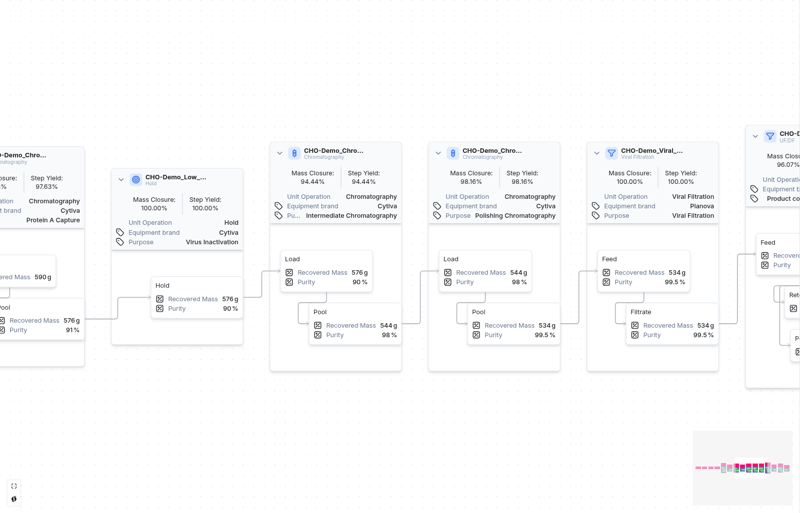
Customize the run data table to provide additional context to the timeseries graph. This includes displaying relevant metadata such as strain ID, run ID, bioreactor size, and more, enhancing the interpretability of the visualized data.
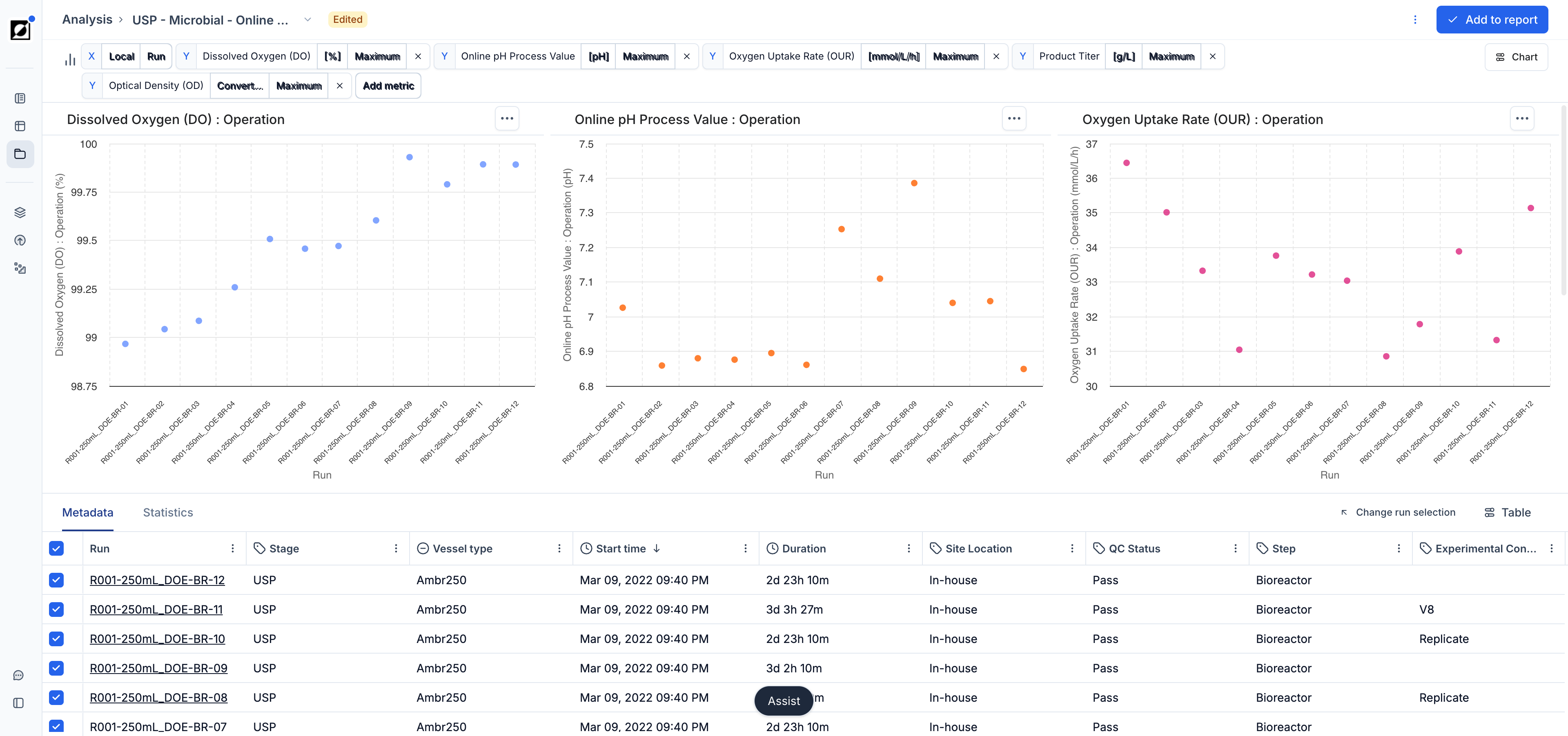
Scatter Chart
Aggregation
Use scatter charts when you want to explore relationships between two variables in your data. They are particularly useful when the input variable for X is non-time-based (e.g., Strain ID, Run ID). You have the option to choose between a variety of aggregations for the Y input variable, such as mean, standard deviation, sum, count, minimum, maximum, last value, etc. For example, compare 'Product (Last)' versus 'Run ID' or 'OD (Maximum)' versus 'Strain ID'. Use this tool to identify trends, clusters, outliers, or other patterns in your data, facilitating data-driven decision-making and analysis.
Continuous vs. Categorical X-Axis
When the selected X variable is numeric, you can switch between Continuous and Categorical mode in the Chart settings panel under X-Axis. Continuous mode plots values on a numeric axis and enables statistics. Categorical mode treats each X value as a distinct group, which is useful for comparing conditions that happen to have numeric labels (e.g., passage numbers, concentration levels).
Statistics
Enable the Show statistics toggle in the Chart settings panel to overlay statistical summaries when X values have multiple entries per category. The available statistics are mean, standard deviation, standard error, count, and lower/upper 95% confidence intervals. Statistics are disabled when the X-axis is set to Categorical mode.
Bar Chart
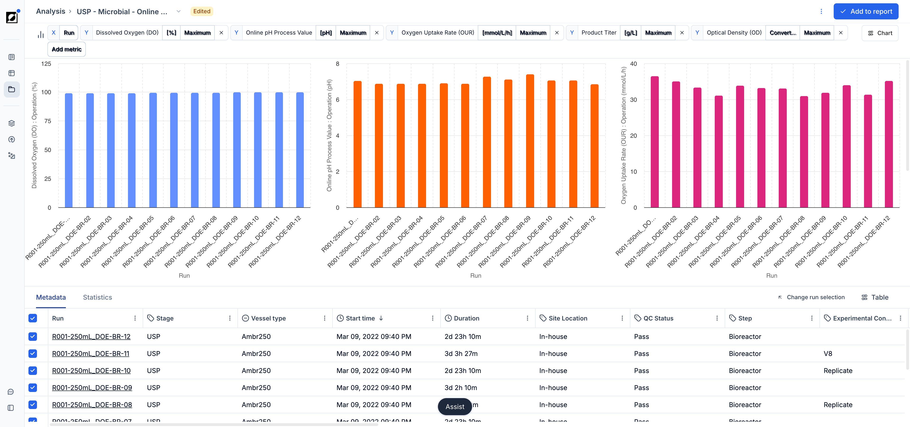
Bar charts offer a clean categorical view of your aggregated run data — ideal for comparing a metric's summary value (e.g., final titer, peak OD, mean pH) across a set of runs or conditions side-by-side. Switch to bar chart view using the Chart settings panel. The X-axis is driven by a categorical run attribute (e.g., Run ID, Strain, Condition) and the Y-axis uses the same aggregation options available in scatter charts (mean, max, last, etc.). Use Color by in the Chart settings panel to color bars by a run attribute for additional visual grouping. Statistics overlays such as mean, standard deviation, and 95% confidence intervals are calculated automatically when multiple runs share the same X category.
Analysis Templates
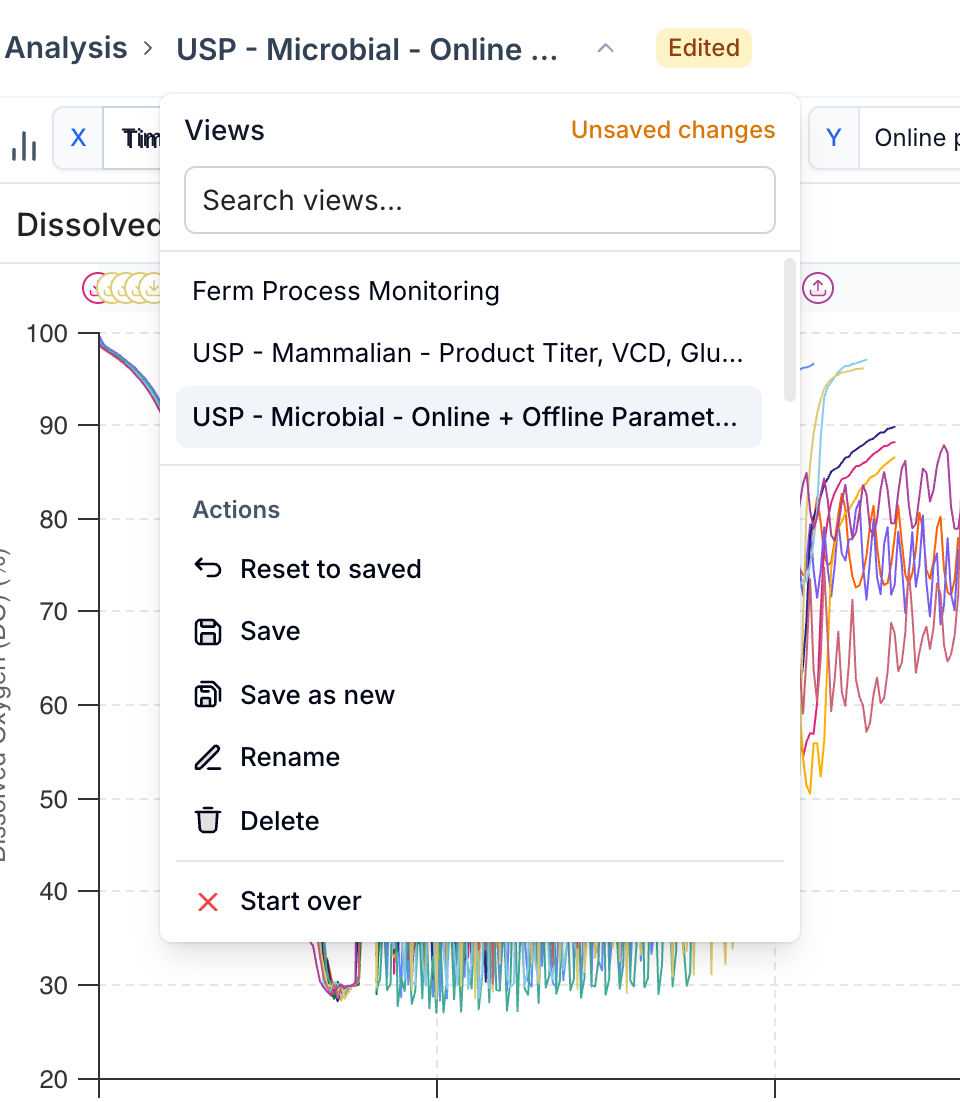
Analysis Templates let you save and reuse chart configurations — metric selections, split settings, y-axis ranges, and more — so you can apply a consistent view across different sets of runs without re-building it each time.
Creating a Template
Set up your chart view as desired (metrics, split settings, layout, y-axis configuration), then open the template selector in the chart header and choose 'Save as new'. Give the template a name. Templates are shared across your organization.
Applying a Template
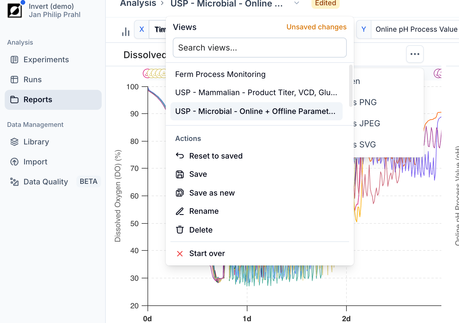
Select a saved template from the template dropdown in the chart header. The analysis will update to match the saved configuration. If you modify the view after applying a template, an 'Edited' badge appears to indicate the current state has drifted from the saved template.
Managing Templates
From the template dropdown you can save changes back to the current template ('Save'), rename it, reset to the last saved state ('Reset to saved'), or delete it. Use 'Start over' to clear the template selection and begin with a fresh, unsaved configuration.