Changelog

What's new in Invert

New features, improvements, and updates to the Invert platform.

Filter

Custom EventsImprovement

Event and phase types in Invert are no longer one-size-fits-all. Every organization has its own terminology — what one team calls "Growth Phase" might be "Cultivation Phase" or "Pre-Transfection Phase" at another. An AAV process needs "Co-Infection" and "Transfection" events that a CHO fed-batch process never uses.

Now you can configure your event and phase types directly from the Library, so your process model matches your team's nomenclature.

What you can do

  • Rename any event or phase type to match your internal terminology. Call it what you call it — the change shows up everywhere: event creation, chart annotations, timeline views, Assist conversations, reports, and exports.
  • Create new types within the existing categories (Additions, Removals, Observations, Phases, Transfers) for events specific to your process. "Co-Infection Start," "Transfection Event," "Methanol Feed Start" — whatever your workflow requires.
  • Archive types you don't use, so they stop cluttering dropdowns and creation flows. Your team only sees what's relevant to their work.

How it works

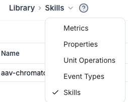
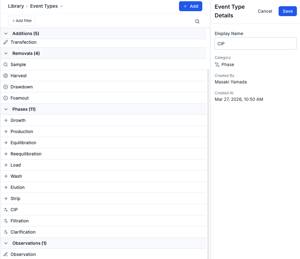
Open the Library and navigate to the new Event Types tab. You'll see all types grouped by category. From there, click into any type to edit its display name, or create a new one by selecting a category and providing a name. Changes propagate immediately — every surface in Invert picks up your terminology.

Phases work the same way. A phase is a pair of events (start + end) that define a time range, and they're managed alongside point-in-time events in the same Library view.

Automatic type creation during ingestion

When data comes in that references an event type you haven't configured yet, Invert creates it automatically — no manual setup required. The new type appears in your Library where you can rename or organize it. Ingestion is never blocked by a missing type.

Works with Assist

Assist uses your custom display names in conversation. If you've renamed "Growth Phase" to "Expansion Phase," that's what Assist says — no fallback to generic names.

Available now for all organizations.

Custom Events

Introducing the Data Quality Dashboard (beta)New

Good data quality is the foundation of reliable science. The new Data Quality dashboard gives you a clear, continuous view of how your data holds up against FAIR principles and AI/ML readiness standards — so issues get caught early rather than discovered downstream.

Each issue is ranked by severity and tagged to the FAIR dimensions it affects, helping you prioritize what matters most. Clicking into an issue gives you the context you need to make an informed decision, and many can be resolved in just a step or two. You stay in control throughout — the dashboard guides you, but the call is always yours.

We're launching with an initial set of rules and will be expanding them continuously. Let us know what data quality issues you'd like us to tackle next!

Analysis Templates: Saved Chart ConfigurationsImprovement

Setting up the same chart configuration repeatedly — quantities, axes, chart type, splits, aggregations — adds up. Analysis Templates let you save a plot block's configuration once and reuse it across any runs or reports.

When you apply a template, it configures the chart while preserving your current run selection — so you can define a standard view once and apply it to any set of runs instantly.

Similar to using Saved Views on the runs page: a dropdown in the plot block editor lets you select, save, rename, or delete templates. Templates are shared across your team, making it easy for anyone to recreate consistent analyses for process monitoring and reporting.

Some examples to get you started:

  • Titer regression — titer vs. VCD scatter with your preferred axis scaling and split-by configuration
  • Metabolite overlay — glucose, lactate, and ammonia time series on a shared x-axis with phase splits
  • Growth kinetics — VCD and viability profiles with event markers for feeds and samples
  • Process parameter monitoring — pH, DO, and temperature across runs with aggregation bands

Reports: Direct Python AnalysisNew

Reports now support full Python execution — replacing Notebooks with a more powerful, collaborative way to analyze and visualize your data without leaving Invert: Code Blocks

How it works

Your run data is automatically available as structured data frames. Add a code block to any report, write Python to process, analyze, and visualize it — or describe what you want to see and let Assist generate the code for you.

What can you do with them?

  • Run Python against your run data directly in Reports — no exporting, no context switching
  • Let Assist write the analysis so anyone on your team can get answers, not just the people writing scripts
  • Upload and combine external data alongside your Invert data
  • Update your data frames as new runs come in and re-execute your analysis
  • Share your reports with your team. They see the results, the code, and the data behind it

Why this matters

Code blocks make it possible for anyone on your team to process and visualize data, not just the people comfortable writing Python. That means more people running analyses, faster answers, and fewer bottlenecks.

Available now for all users.

Reports: Direct Python Analysis

Experiment Summary DashboardsNew

Open any experiment and immediately cut to the chase: see which conditions hit your targets, what data is missing, and how your runs connect.

Experiment Summary Dashboards now provide a unified, experiment-level view that brings your runs, experimental context, and analyses together.

  • Surface key insights automatically: Quickly identify primary findings, critical observations, and missing data so you have a starting point in understanding your process.
  • Assess performance against objectives: View the study design and target conditions alongside the actual results so you can quickly assess whether the experiment achieved its objectives.
  • Understand process relationships: Visually map together how the runs are connected, trace material flows and quickly identify dependencies across the experiment lineage.

Available now for all AI-enabled organizations.

Assist: Enhanced Run DiscoveryImprovement

No more hunting through the run directory.Just ask.

We've upgraded how Assist finds runs. You no longer need to remember run names or pre-select experiments, just describe what you're looking for, and Assist handles the search.

  • Search by metadata: Find runs based on cell line, media formulation, scale, operator, or any parameter available for your data
  • Traverse lineage: Automatically connect upstream seed trains to downstream operations

Example Queries:

  • Cross-campaign comparisons: "Compare VCD profiles for all CHO-K1 runs using Media Formulation B at 200L scale over the past 6 months"
  • Root cause investigation: "Show me the seed train conditions for any production runs that had viability drop below 80% before day 10"
  • Process optimization: "Which feeding strategy produced the highest titer across our DG44 campaigns?"
  • Lineage-aware analysis: "For our top 5 performing batches, trace back to their inoculum conditions and compare passage numbers"
  • Metadata-driven filtering: "Pull all runs from Building 2 bioreactors that used the updated pH control setpoints after March 2025"
  • Anomaly detection: "Find runs where lactate accumulated faster than 0.5 g/L/day in the first 72 hours"

Reports - Major UpdateImprovement

We've redesigned Reports and the Reports Directory to give you more control over how you organize, filter, and share your analyses. This update brings folders, tags, advanced filtering, PDF export, rich formatting, and flexible sharing options (including private reports).

What's New

  • Folders: Organize reports into folders for quick filtering and discovery.
  • Advanced Filters: Search across runs, metrics, and content to find exactly what you need.
  • PDF Export: Generate polished PDFs for sharing outside Invert.
  • Rich Formatting & Images: Add headers, styled text, and embedded images directly in your reports.
  • Flexible Sharing: Choose from workspace-wide, guest-access, or private sharing modes.
  • Bulk Plot Export: Download all relevant plots and data from a plot block with a single click

Filters

The new filter options lets you narrow down reports by multiple criteria simultaneously. Access it by clicking on Add Filter in the reports directory.

Reports - Major Update

Introducing Invert AssistNew

We’re excited to launch Invert Assist, your new AI assistant for bioprocessing. Built on Invert’s trusted data foundation, Invert Assist lets scientists and engineers explore their process data through a simple chat interface — rapidly explore process behavior, identify key drivers, and make data-backed decisions with confidence.

Every answer is transparent, traceable, and grounded in your own harmonized data. Watch the launch webinar for more details: Introducing Invert Assist — Explainable AI for Bioprocess

We’re rolling out early access now. Connect with your Invert team representative to get started.

Run Summary DashboardsNew

Run Summary Dashboards are a streamlined view that helps you understand run performance at a glance. Instead of sifting through raw data tables, you now land on an automatically generated dashboard that brings key metrics and context together in one place.

Each dashboard is generated from your available run data, including metrics, properties, and events, to summarize what’s happening and how the process is performing.

  • Live KPI Tiles: Biomass, titer, pH, temperature, and control metrics update automatically as the run progresses, always showing the latest recorded values and when they were last updated.
  • Preview Charts: Compact visualizations for environmental parameters, biomass & product, and feed trends, with direct links to the full Analysis view for deeper exploration.
  • Objectives and Notes: Automatically generated from run data and events to summarize goals and outcomes. Users can regenerate or edit as needed.
  • Event Summary Sidebar: Key events displayed alongside process data to help correlate actions and results.

The autogenerated dashboards are powered by our AI-enabled tooling. To opt in and enable these features, reach out to our team.

Run Summary Dashboards

Live IndicatorNew

Invert now automatically highlights which runs are live. Receiving data from the last five minutes triggers the "live" status.

This indicator is visible in the run table and analysis view. You can also filter by live status, to easily find what's running right now. Run status (Draft, In-Progress, Completed, etc.) remains separate.

Keep an eye out for the indicator, and try the filter next time you're wondering what's happening today!

Live Indicator

🔀 Scatterchart Mode ToggleImprovement

You can now switch the x-axis in scatter charts between continuous and categorical modes—perfect for exploring both trends and group comparisons. Try it out in your next analysis.

💾 Saved ViewsNew

Are you coordinating experiments across multiple projects or programs?

Quickly update your Run Table to pre-saved configurations of filters, columns, and groupings using Saved Views.

Analysis - Event CreationNew

Have you noticed an anomaly in your run while doing process analysis?

Quickly document any events, including observations and sample events, directly from the event bar above your run in any analysis.

📁 Reports and Import HistoryNew

We've added two new tabs to Run Summary page — Import History and Reports. You can now find all relevant ingestions and reports run directly from the run summary page.

The Reports page now has a filter that can be accessed through the magnifying glass button on the top right of the page or through the ctrl+f keyboard shortcut.

📁 Reports and Import History

🔎 Subsetting Formula ResultsNew

We’re excited to announce a new customization in Formulas that limits the output to distinct time points, inferred by the selected dependency.

This option is perfect for offline data calculations such as yield and productivity where you have the highest confidence in the data at the time of the recorded measurements.

To enable this option, head to your formula's settings page and select the desired dependency in the Subset Results dropdown within the Formula Calculation Customization options.

🔎 Subsetting Formula Results

Process Models - OptimizationNew

Run the optimizer on your models to determine which runs to explore next. This takes the guesswork out of experimental planning and maximizes the value of your existing data, helping you make faster, more effective decisions throughout your process development.

How It Works

  • Build your model: Select the output you want to optimize—whether it’s a specific product titer, pH balance, or another metric.
  • Define Your Parameters: Set boundaries for your key variables, such as temperature, feed rates, or substrate concentrations.
  • Run the Optimizer: With a single click, the system calculates the most promising runs to explore next.
  • Explore Suggested Runs: Conduct the recommended experiments and feed the results back into your model to continuously refine it.

Need Assistance? Please don't hesitate to reach out for a guided walkthrough.

Upgrades: Line Charts, Run Summary, SmoothingNew

Improved Charts: Faster, Sharper, and Higher-Resolution

Our charting library was slowing us down, so we made a major upgrade. Charts now render faster and display data at a higher resolution without downsampling, offering a more detailed and precise view of your timeseries data.

We’re working hard to iron out any lingering bugs, but if you spot something, please let us know! Your feedback is invaluable in helping us refine this experience.

Run Summary Details

Metrics: Easily view all timeseries metrics for a given run. We’ve also added statistical summaries and a streamlined editing flow for metric archiving, giving you more control over your data.

Attachments: Run attachments now have their own dedicated tab, making it simpler to upload, review, and download files.

Timeseries Smoothing Functions

Try out simple_moving_average() or centered_moving_average() in Formulas if your process signals are too noisy. Each allows you to smooth the specified metric over a customizable time interval.

Example: Centered Moving Average over a 1-hour period of a Dissolved Oxygen (DO) signal.

Introducing Parent MetricsNew

Data can be messy! It may have differing names or even differing units, especially when coming from different sources.

We've introduced a way to simplify your metric library through Parent Metrics. Parent metrics allow you to combine data across existing metrics and even from formulas into a unified metric concept.

Metrics can now be assigned to a parent metric in the library, and the parent metric can be used throughout Invert.

  • Scroll a shorter, more meaningful list of metrics
  • Combine formulas and metrics seamlessly for analysis
  • Improve traceability back to the data source and original name

Chart Export ImprovementsImprovement

We've improved the Chart Export functionality, providing more flexibility and control when exporting charts as PNG. You can now export charts with predefined, standard settings for consistent, high-quality results.

Available Export Options:

Standard Export: Generates charts with fixed aspect ratios and larger font sizes, optimized for use in presentations or documents like PowerPoint and Word.

In-view Export: Creates charts based on your current graph view and browser zoom settings, allowing for customized exports that match what you see on your screen.

How It Works:

  1. Create your line chart.
  2. Save it as a PNG by clicking the three dots button.
  3. Choose between 'Standard' or 'In-view' in the Export Preview.
  4. Press 'Export' to save your chart.

Data Export into Excel ImprovementsImprovement

Improved Configurability for Data Export into Excel!

Our new exporting options give you greater control over how data is exported into Excel. These enhancements are particularly beneficial for handling sparse data sets and managing large volumes of data.

Interpolation:

  1. 'None': Data export without interpolation

  2. 'Linear Interpolation': Fills in gaps in sparse data sets using linear interpolation

Resample Period:

  1. 'None': Data export without resampling.

  2. Resampling at specific interval ('1 Minute', '5 Minutes', '15 Minutes'): Reduces the number of rows by resampling data at the selected interval, using the average value within each period.

How It Works:

  1. Create your line chart.
  2. Click the 'Export' button to open the Export Configuration modal.
  3. Choose your preferred options for Interpolation and Resample Period.
  4. Press 'Export' to download your customized data export.

Metric & Formula NotesImprovement

Curious to learn more about the metric selected in your report? Hover your cursor over the metric name in any analysis or report to see descriptive notes and the full equation of the given formula.

How to add notes:

  1. Select a metric or formula from the Library.
  2. Click Edit.
  3. Add your desired description in the 'Notes' section.
  4. Save your changes.
  5. Hover over the metric or formula name in an analysis or report to view the note.

Chart Customization - Y-Axis BoundsImprovement

We are excited extend the charts feature set with customizable y-axis bounds. You can now overwrite the auto-generated y-axis range with manually entered values.

How It Works:

  1. Open the 'View' sidebar or click on the y-axis.
  2. Navigate to the 'Y-Axis Settings' section.
  3. Select the y-metric you want to customize.
  4. Define your desired Start range, End range, and Interval (optional).
  5. Confirm by pressing the 'Apply' button.

Try it out today for a more tailored data visualization experience! Check out the Help Article for more information.

Ambr 250 Integration - Sampling and Phase Events!Improvement

We've built new capabilities for the Ambr 250 Live integration.

You'll now see:

  • sample events for both automated and manual samples, complete with volume and destination
  • observation events which mark the start of each process phase

If you're interested in learning more about the automated data ingestion options, please reach out!

🧮 Formulas Improvements - PreviewsImprovement

We've made a few changes to simplify formula creation and troubleshooting:

  • Preview your formula with a recent run to validate the calculation
  • Keep track of parentheses with color-coded parenthesis pairs
  • Add a note to maintain context of any assumptions in the calculation
  • Add your own custom constants

Process Models - Regressions!New

  • Expanded Model Selection: We've added two more models to our repertoire: Elastic Net Linear Regression: Combines Ridge and Lasso regularization for a balanced, interpretable model. Gaussian Process Regressor (GPR): Ideal for understanding uncertainty in predictions, treating each input variable with consideration to their covariance.
  • New Scaling Options: MinMax and Standard scalers are provided for additional data preprocessing.
  • Interactive Visualization: Explore the Partial Dependence and Braid plots to better understand the outputs of the model.
  • Prediction for Experimental Design: Dive into the relationships between process parameters and key performance indicators using your own custom ML prediction model and determine what design space to study next.

More details available at our help center

Ambr 250 Integration UpdatesImprovement

We've been rolling out improvements to the Ambr 250 Live integration. You'll notice:

  • Run Start, Run End, and Status are now automatically set by the integration.
  • Runs from this system are assigned a variable "Source" which is set to "Ambr 250" by default.
  • The integration can be configured to automatically ignore variables, by specific names or partial matches.

If you're interested in learning more, please reach out!

Events EnhancementsImprovement

Adding context to your bioprocess has never been easier! Tell the story behind your data using our updated Event feature.

  • Add new events using the event side bar without navigating away from your analysis
  • Distinguish between events with new icons and event tracks
  • Upload images to any event
  • Quickly access event details through tooltips

Phase-Based Formulas 🌱New

Introducing Phase-Based Formulas: Define growth or production phases and apply precise calculations directly to your phase of interest. No exporting or bulk data cropping required.

  1. Define your phases through the Run Events editor
  2. Specify a phase to be used in any formula

Bulk Run SelectionImprovement

We now support selecting a range of runs using Click + Shift functionality! To use this feature, click on the run at the beginning of the range, hold down the Shift key, and then click on the last run in the range. This will select all the runs in between. This functionality works both in the Run Table and within Charts!

Molar ConversionNew

We now support adding molar mass to your metrics, enabling easy conversion between g/L and Molarity with the Molar Conversion feature!

To use this: Head to the Metrics library and select a metabolite or chemical product, then click edit. From there you can specify the molecular weight. This will enable conversions on the fly in the table and graphs!

Run ComparisonNew

Not sure which parameters have changed across your runs? We've rolled out a Run Comparison tool, enabling you to quickly identify differences between runs with just a few clicks.

To get started: Select your runs of interest, then click "Add differences" in the new Add Column dropdown menu. This will add any metadata columns to the table that have differences within your selected run set.

You can use this in Reports and the Run Table.

Scatter Plot StatisticsNew

Introducing Scatter Plot Statistics!

Access automatically calculated statistics directly in the table view under the scatterplot in the "Statistics" tab.

Mean distributions, correlations and linear fits are now calculated and displayed with all scatterplots as appropriate.

Parent Run -> ExperimentImprovement

As of October 9, 2023 we have updated the nomenclature for the run property "Parent Run" to "Experiment". This update has been made to support ongoing work for experimental planning.

What is an experiment? How should it be used?

An experiment is a grouping of runs, typically with overlapping operations timelines used to help manage organizational complexity.

  • For example - a set of 12 or 24 runs that were performed in the same operational window on a Sartorius Ambr could be batched into a single Experiment.
  • The seed flask and seed train runs can also be included in this experiment if that organizational grouping is helpful.
  • Run data can still be compared across experiments by simply selecting the runs of interest.

Impacted User Flows:

  • Filtering
  • Grouping
  • Exports

This change does not impact any existing automated ingestion flows. "Parent Run" can still be used for the column header in manual ingestions.

Please reach out if you have any questions or concerns!

Compile your Analyses into a ReportNew

Share findings, observations, conclusions with your colleagues through the upgraded Reports interface.

  • You can now store several analyses within a single report
  • Share context and conclusions through free text annotations for each plot block

Check out a quick walkthrough here

Nested Formulas and Advanced FunctionsNew

Formulas can now be referenced within other formulas! Simplify complex expressions by creating named reusable intermediates.

Please reach out to our staff through Help and Support if you would like support in converting any existing formulas.

New functions are available in formulas to support timeseries evaluations.

Timeseries Integration

Function: time_integral()

Example: Base Volume Totalizer = time_integral(base_volumetric_pump_rate)

Timeseries Derivative

Function: time_derivative_hours(), time_derivative_minutes(),time_derivative_seconds()

Example: Acetate Accumulation Rate = time_derivative_hour(acetate_concentration)

Linear Regression

Function: linear_regression()

Evaluation: Y = mX+b, where X = Elapsed Run Time

Log-Linear Regression

Function:log_linear_regression()

Evaluation: ln(Y) = ln(b) + mX or Y = b*exp(mX), where X = Elapsed Run Time

Run EventsNew

Introducing Run Events: Enhance Bioprocess Visibility and Documentation!

  • Seamlessly document events and observations directly on the graph, providing clarity and context at every stage.
  • Gain insights into sample events, start times, and more on the Run Events page and directly on your analysis, enhancing your understanding of the bioprocess.
  • Effortlessly upload observations through a user-friendly interface, streamlining data input and boosting efficiency.

Run LineageNew

Trace Your Bioprocess from Upstream to Downstream with Run Lineage!

  • You can now effortlessly connect your fermentation runs to downstream processing through to stability results.
  • Visualize the complete journey of your bioprocess, identify dependencies, and gain comprehensive insights for informed decision-making.
  • Run Lineage is available through the Run Summary page. Reach out to learn more!

Scatter charts ✨New

Quickly compare Key Process Metrics across runs using the Scatter Chart View.

  • X axis can be continuous process data or categorical metadata
  • Several data aggregation methods available including mean, min, max, initial, and final values

Clean Up Your Metadata 🛀New

  • Run metadata is critical to differentiate runs and to properly interpret process data. Process metadata includes information such as strain names, vessel IDs, media used and process control setpoints.

  • Using the new Bulk Edit feature, quickly update or add new metadata so that the context for each run is appropriately documented.

  • The analysis graphing page also now includes the metadata table for an overview of the metadata when reviewing your graphs.

Semi-log Axis Scaling 📈New

Want to compare exponential data such as growth curves or decay rates? Modify the axis scaling in the metric settings to turn on semi-log scaling mode.

Explore Run Metadata 🗺️New

Run metadata is now more accessible than ever. Check out the table view and add relevant metadata columns for reference during run exploration and selection.

  • Line textures now help distinguish between metrics in "All-in-one" charts.
  • Colors are consistent per run when charts are split by metric.

Converting units on the fly 🚀New

Invert now automatically handles unit conversions for you on the backend, so that a sensor measuring flow rates in L/h and another in m^3/h will be displayed uniformly in the metric's default unit.

You can also decide yourself and change the unit on any metric, by choosing between available display options on the metric and we'll convert it to whatever you like – useful for comparing across metrics of different units.

Converting units on the fly 🚀

Charts just got a make-over ✨Improvement

Following the addition of formulas in the previous release, charts had some quirks and UX that needed improving.

💯 A table

Underneath every chart we've introduced a table that replaced the awkward tooltip on hover. It displays the value for the current hovered position (or its nearest neighbour).

When not hovered you can select different statistics: mean, sum, standard deviation, min and max, to easily compare runs against each other.

🔥 Tooltips

We did not kill tooltips, but we made them much more usable. Instead of showing everything (better viewed in the table), we now only show the value of the most recently hovered line.

If you highlight one or more lines the tooltip will show values for all the highlighted lines. Highlight a line by clicking the corresponding colour in the table or directly on the line.

🔣 Units: same same, but different

Often you want to plot a handful of metrics in the same chart. Before, each would get its own axis. Now you decide whether metrics that share units should also share axes. Toggle "Combine shared y-axes" depending on what's useful in your context.

Other fixes in this release

  • Fix where sometimes you could not add/remove quantities
  • Fix for zero-values shown as - not 0
  • Made it clearer that mappings can process multiple files
  • Better state management for uploading multiple files
  • Fix for run start dates not displaying as date-time
  • Removed denominator in groups until filter applied
  • Moved the "add prop" button on the run/edit page to be more visible
  • Filtered away unsuccessful ingestions from status page
  • Made search only search for one type of data at a time
  • Fix for hidden checked checkbox on metrics page
  • Fix for unneeded scrollbars for non-Mac users
  • Fix for Ctrl+Click "Open" button on parent run not opening in a new tab
  • Fix for duplicate y-axis ticks
  • Fix the chart/table height distribution for small screen sizes
  • Reset highlighting when chart filters/quantities change
Charts just got a make-over ✨

Formulas - derived metricsNew

Today, we're introducing formulas to derive metrics based on your existing data. Formulas works just like other metrics on Invert, but are calculated on the fly using custom defined formulas.

Use formulas to plot derived metrics on charts, as bars or lines, or export them to Excel, JMP, etc. – just like every other metric.

Build new formulas by reference to other metrics, timerseries or single data points, and using basic arithmetic operators – or more complicated math and aggregations.

Let us know what you think by writing us at support@invertbio.com

Formulas - derived metrics