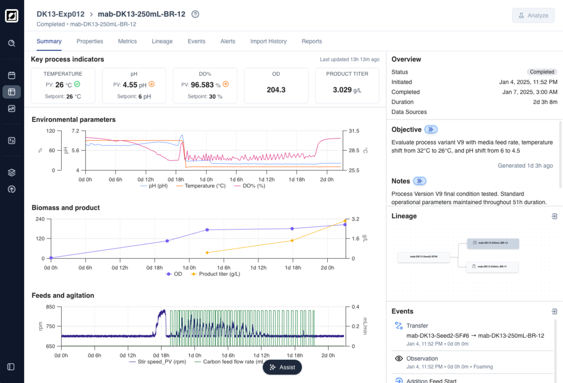
Run Summary Dashboards are a streamlined view that helps you understand run performance at a glance. Instead of sifting through raw data tables, you now land on an automatically generated dashboard that brings key metrics and context together in one place.
Each dashboard is generated from your available run data, including metrics, properties, and events, to summarize what’s happening and how the process is performing.
- Live KPI Tiles: Biomass, titer, pH, temperature, and control metrics update automatically as the run progresses, always showing the latest recorded values and when they were last updated.
- Preview Charts: Compact visualizations for environmental parameters, biomass & product, and feed trends, with direct links to the full Analysis view for deeper exploration.
- Objectives and Notes: Automatically generated from run data and events to summarize goals and outcomes. Users can regenerate or edit as needed.
- Event Summary Sidebar: Key events displayed alongside process data to help correlate actions and results.
The autogenerated dashboards are powered by our AI-enabled tooling. To opt in and enable these features, reach out to our team.