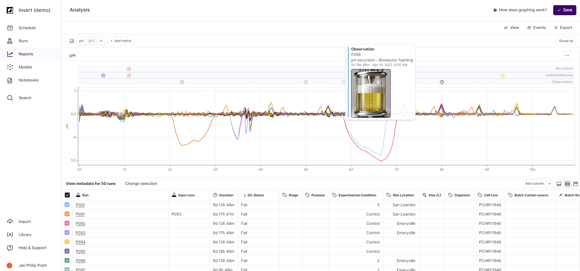
All chart settings are accessed via the Chart button in the chart header, which opens a settings panel.
Chart Types
Switch between Line, Bar, and Scatter using the Chart type selector at the top of the Chart settings panel.
Time-series Charts (Line)
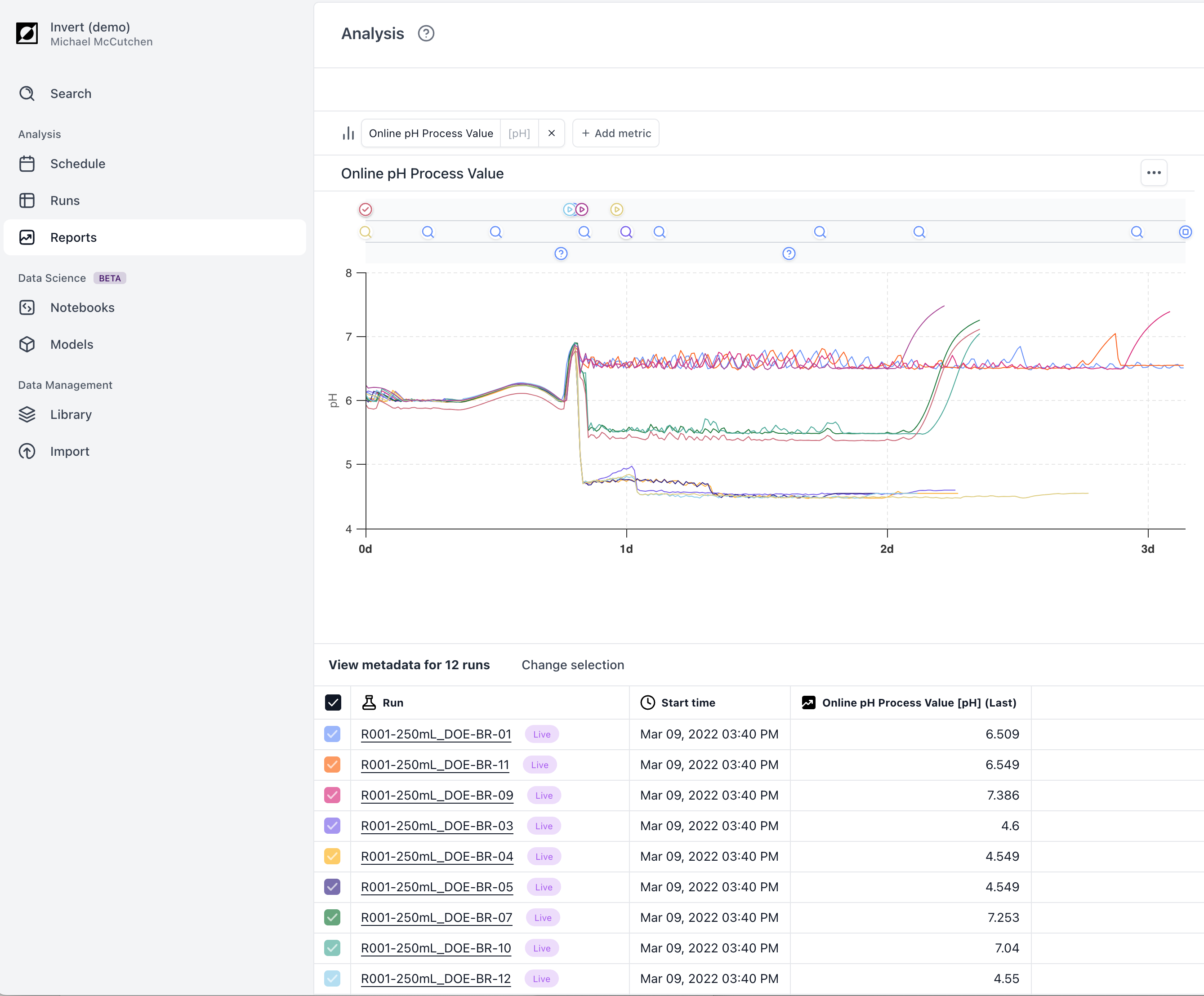
Time normalization
All time-based charts are normalized to the Run Start time, which calculates the Elapsed Run Time (ERT). Use the Time Filters section in the Chart settings panel to change the normalization basis (e.g. to a specific event like Feed Start, or to a phase like Production Start).
Zoom
X-axis drag zoom: Click and drag within the graph to zoom into a specific time window. The current bounds appear in the top right corner. Click the ✕ to reset.
X and Y axis custom ranges: Open the Chart settings panel to set precise Min / Max / Interval values for both the X and Y axes. These compose with drag-zoom so both can be active simultaneously. Overridden values are shown highlighted; use the Reset button within each axis section to revert.
Downsampling and Interpolation
To maintain a responsive interface, raw data is downsampled for line charts. Data is interpolated between time points to enable formula calculations and grouped statistical comparisons across runs with different data frequencies. Higher-resolution raw data renders as you zoom in, and is also available via data export.
Chart Splits
Use the Split by control in the Chart settings panel to choose how runs and metrics are distributed across graphs:
- All in one — all metrics and runs on a single graph; each metric has a distinct line style, each run a unique color.
- Split metrics — one chart per metric; run colors are consistent across charts.
- Split runs — one chart per run or run group; metric colors are consistent across charts.
- Separate — each metric and run combination gets its own chart.
Chart Layout
Control the number of charts per row: Auto, Full width, 2 columns, or 3 columns.
Grouping
Use Group by in the Chart settings panel to categorize runs by a metadata attribute and access statistical comparison tools. Grouped line charts display the median (50th percentile) as a solid line with a shaded band from the 16th to 84th percentiles — a distribution-agnostic representation of central tendency and spread. For normally distributed data, this band corresponds to approximately ±1 standard deviation.
Scatter Charts
Switch to scatter via the Chart type selector in the Chart settings panel. The X-axis defaults to Run ID but can be changed to any categorical or aggregated metric. The Y-axis supports any numeric value including time-series aggregations (mean, min, max, std, first, last, count), single-point properties, and calculated metrics.
When the X variable is numeric, toggle between Continuous and Categorical X-axis mode in the Chart settings panel. Enable Show statistics to overlay mean, standard deviation, standard error, and 95% confidence intervals per X category.
Bar Charts
Bar charts display aggregated metric values as bars, with the X-axis driven by a run attribute (e.g. Run ID, Strain, Condition) and the Y-axis using the same aggregations as scatter. Use Color by in the Chart settings panel to add a second grouping dimension via bar color.